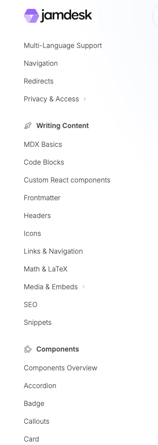
Navigation
Navigation in Jamdesk uses tabs, groups, and pages to organize your documentation. External links can be added using anchors.
Your sidebar and top bar are defined entirely in docs.json. The navigation hierarchy has three levels: tabs for top-level sections, groups for collapsible folders, and pages for individual entries. Anchors add external links that appear on every page.
Structure Overview
{
  "navigation": {
    "tabs": [
      {
        "tab": "Documentation",
        "icon": "book-open",
        "groups": [
          {
            "group": "Getting Started",
            "pages": ["introduction", "quickstart"]
          }
        ]
      }
    ]
  }
}
Concepts
Tabs
Top-level navigation sections. Control their position with the tabsPosition setting:
| Value | Position |
|---|---|
"top" | In the header tab bar |
"left" | At the top of the sidebar |
The default position depends on your theme:
| Theme | Default |
|---|---|
| jam | "left" |
| nebula | "left" |
| pulsar | "top" |
{
  "tabsPosition": "left",
  "navigation": {
    "tabs": [
      { "tab": "Guides", "icon": "book", "groups": [...] },
      { "tab": "API", "icon": "code", "groups": [...] }
    ]
  }
}
Sidebar icons render in the Font Awesome Solid variant by default. Override any
icon's weight with a style prefix (light/book) or the
icon object form.
External Links (Anchors)
Add external links that appear at the top of the sidebar on all pages:
{
  "anchors": [
    { "name": "Blog", "href": "https://blog.example.com", "icon": "newspaper" },
    { "name": "Status", "href": "https://status.example.com", "icon": "signal" }
  ]
}| Field | Type | Required | Description |
|---|---|---|---|
name | string | Yes | Display text for the link |
href | string | Yes | URL (opens in new tab) |
icon | string | No | Font Awesome icon name |
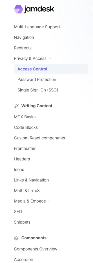
Groups
A group is a labeled set of sidebar entries inside a tab. Groups add a second level of hierarchy to your sidebar and let you hide deeper sections behind accordion-style folders.
{
  "group": "Authentication",
  "pages": ["auth/overview", "auth/tokens"]
}
Section and accordion behavior
Top-level groups are permanent sections: the title and its pages are always visible, and clicking the title jumps to the group's first page. Nested named groups are collapsible accordions. A nested group starts closed unless it contains the current page or sets expanded: true. On initial load and route changes, the current page's full ancestor chain opens automatically so the active link is revealed; visitors may still collapse the active nested group manually.
| Group type | Default behavior |
|---|---|
| Top-level group | Always open, no chevron. Clicking the title navigates to the group's first page. |
| Nested named group | Collapsed until active, manually opened, or configured with expanded: true. Clicking a closed group opens it and clicking an open group closes it; navigation only happens when you click a page. |
| Unnamed container | Always renders its pages because it has no label or toggle control. |
Use top-level groups for the major sections of your sidebar and nested groups to keep longer sections scannable. Expansion state persists during in-app navigation and resets on a full page refresh.
Group fields
| Field | Type | Required | Description |
|---|---|---|---|
group | string | Yes | Display label shown in the sidebar. |
pages | array | Yes | List of page paths and/or nested group objects (see Nested Groups for the nested shape). |
icon | string | No | Font Awesome icon name displayed beside the group label. |
tag | string | No | Small badge next to the label (e.g., "New", "Beta"). |
root | string | No | Page path the group links to when the label is clicked (instead of jumping to the first child page). |
hidden | boolean | No | Hide the group from the sidebar by default. The pages remain reachable by direct link. |
public | boolean | No | Mark the group as publicly accessible. Defaults to the parent tab's setting. |
expanded | boolean | No | Open a nested named group by default on first page load. Top-level groups are always open, so the flag has no visible effect there. The current page's ancestor groups open automatically on initial load and route changes. |
Pages
Individual documentation pages, referenced by their file path (without .mdx):
"pages": ["introduction", "guides/quickstart", "api/endpoints"]By default, the sidebar title is generated from the file name: dashes become spaces and each word is capitalized. For example, "api/getting-started" displays as "Getting Started".
To set a custom sidebar title, use an object instead of a string:
"pages": [
  "guides/quickstart",
  { "page": "deploy/aws", "title": "AWS Route 53 & CloudFront" },
  { "page": "content/seo", "title": "SEO" },
  { "page": "api/users", "title": "List Users", "method": "GET" }
]
This is useful for acronyms, proper nouns, and API endpoint badges.
| Field | Type | Required | Description |
|---|---|---|---|
page | string | Yes | File path without .mdx |
title | string | No | Custom sidebar title |
icon | string | No | Font Awesome icon name |
tag | string | No | Small badge next to the title (e.g., "New", "Beta") |
method | string | No | HTTP method badge: GET, POST, PUT, PATCH, or DELETE |
Multiple Tabs
Create separate sections for different audiences:
{
  "navigation": {
    "tabs": [
      {
        "tab": "Guides",
        "icon": "book",
        "groups": [
          { "group": "Getting Started", "pages": ["intro", "quickstart"] }
        ]
      },
      {
        "tab": "API Reference",
        "icon": "code",
        "groups": [{ "group": "Endpoints", "pages": ["api/auth", "api/users"] }]
      }
    ]
  }
}
External Tab Links
Link to external documentation or resources directly from tabs:
{
  "navigation": {
    "tabs": [
      { "tab": "Docs", "icon": "book", "groups": [...] },
      { "tab": "GitHub", "icon": "github", "href": "https://github.com/example/repo" }
    ]
  }
}
External tabs open in a new browser tab.
Nested Groups
Organize complex documentation with nested structures:
{
  "group": "SDKs",
  "pages": [
    "sdks/overview",
    {
      "group": "JavaScript",
      "pages": ["sdks/js/install", "sdks/js/usage"]
    },
    {
      "group": "Python",
      "pages": ["sdks/python/install", "sdks/python/usage"]
    }
  ]
}